The WPF List Box is a very versatile control. In this multi-part series of blog posts, you will be shown a myriad of ways to coerce the List Box to work the way you want. You will learn how to create multi-row and column items with images. How to change the information displayed in each row dynamically. How to present the list box horizontally. You will learn to use data triggers, sorting, grouping and filtering. In this post, you learn to add multiple rows and columns to each row of your list box.
Before reading this blog post, it is recommended you read my blog post Using WPF List Controls - Part 1 so you can learn about the data layer used in this blog post and review how WPF list controls work.
Two Column List Box
When most developers think of a list box, they think of a simple list of a single piece of data. However, like most things in WPF, each row of a list box control can contain as much XAML as you want. This means you are free to display many pieces of data within each row of a list box. When using WPF, if you want to display data in two columns, create a <Grid> element and define two columns as shown in the code snippet below.
<Grid>
  <Grid.ColumnDefinitions>
    <ColumnDefinition Width="*" />
    <ColumnDefinition Width="*" />
  </Grid.ColumnDefinitions>
  <TextBlock Grid.Column="0"
             Text="This is Column 1" />
  <TextBlock Grid.Column="1"
             Text="This is Column 2" />
</Grid>
You can see the two ColumnDefinition elements break the Grid into two equal parts. Two TextBlock controls set into each of the Grid columns using the Grid.Column attached properties display the data within the columns.
To apply this scenario to a ListBox, override WPF's default ItemTemplate with a custom ItemTemplate. Into that ItemTemplate, create a <Grid> like the one shown above. In the TextBlock controls, use data binding to bind to the properties of the Product class. Also notice the TextBlock in the second column has its TextAlignment property set to "Right" so the ListPrice value is right justified.
<ListBox Grid.Row="1"
    ItemsSource="{Binding Source={StaticResource viewModel},
                          Path=Products}">
  <ListBox.ItemTemplate>
    <DataTemplate>
      <Grid>
        <Grid.ColumnDefinitions>
          <ColumnDefinition Width="*" />
          <ColumnDefinition Width="*" />
        </Grid.ColumnDefinitions>
        <TextBlock Grid.Column="0"
           Text="{Binding Path=Name}" />
        <TextBlock Grid.Column="1"
           TextAlignment="Right"
           Text="{Binding Path=ListPrice, StringFormat=c}" />
      </Grid>
    </DataTemplate>
  </ListBox.ItemTemplate>
</ListBox>
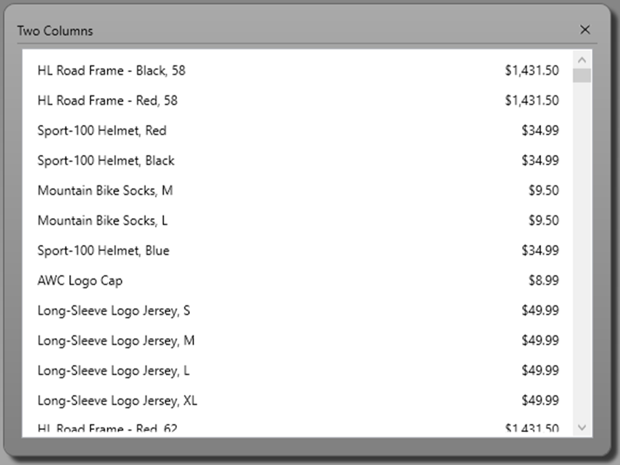
If you run the above code, you would see the ListPrice was NOT right aligned. This is because the normal style for each ListBoxItem control is to left-justify all content. To allow for right alignment, override the HorizontalContentAlignment property to "Stretch". Now the ListPrice will be right justified as shown in Figure 1.
<Style TargetType="ListBoxItem">
  <Setter Property="HorizontalContentAlignment"
          Value="Stretch" />
</Style>
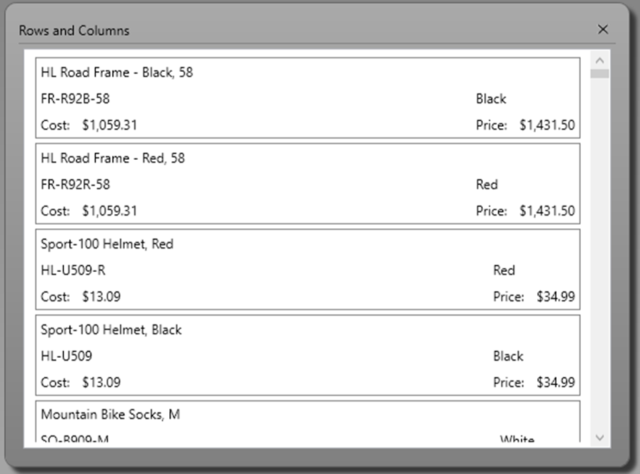
Rows and Columns for Each List Box Item
Just like you add columns by adding ColumnDefinition elements, add rows by adding RowDefinition elements to a Grid as shown in Figure 2. The code below defines two columns and three rows within the <Grid> element. You still need to the same Style element to set the HorizontalContentAlignment to "Stretch" as you did in the last example.
<ListBox Grid.Row="1"
    ItemsSource="{Binding Source={StaticResource viewModel},
                          Path=Products}">
  <ListBox.ItemTemplate>
    <DataTemplate>
      <Border BorderBrush="Gray"
              BorderThickness="1">
        <Grid>
          <Grid.ColumnDefinitions>
            <ColumnDefinition Width="*" />
            <ColumnDefinition Width="Auto" />
          </Grid.ColumnDefinitions>
          <Grid.RowDefinitions>
            <RowDefinition Height="Auto" />
            <RowDefinition Height="Auto" />
            <RowDefinition Height="Auto" />
          </Grid.RowDefinitions>
          <TextBlock Grid.Row="0"
                      Grid.Column="0"
                      Text="{Binding Path=Name}" />
          <TextBlock Grid.Row="1"
                      Grid.Column="0"
                      Text="{Binding Path=ProductNumber}" />
          <TextBlock Grid.Row="1"
                      Grid.Column="1"
                      Text="{Binding Path=Color}" />
          <StackPanel Grid.Row="2"
                      Grid.Column="0"
                      Margin="0"
                      Orientation="Horizontal">
            <TextBlock Text="Cost: " />
            <TextBlock TextAlignment="Left"
              Text="{Binding Path=StandardCost, StringFormat=c}" />
          </StackPanel>
          <StackPanel Grid.Row="2"
                      Grid.Column="1"
                      Margin="0"
                      Orientation="Horizontal">
            <TextBlock Text="Price: " />
            <TextBlock TextAlignment="Right"
              Text="{Binding Path=ListPrice, StringFormat=c}" />
          </StackPanel>
        </Grid>
      </Border>
    </DataTemplate>
  </ListBox.ItemTemplate>
</ListBox>
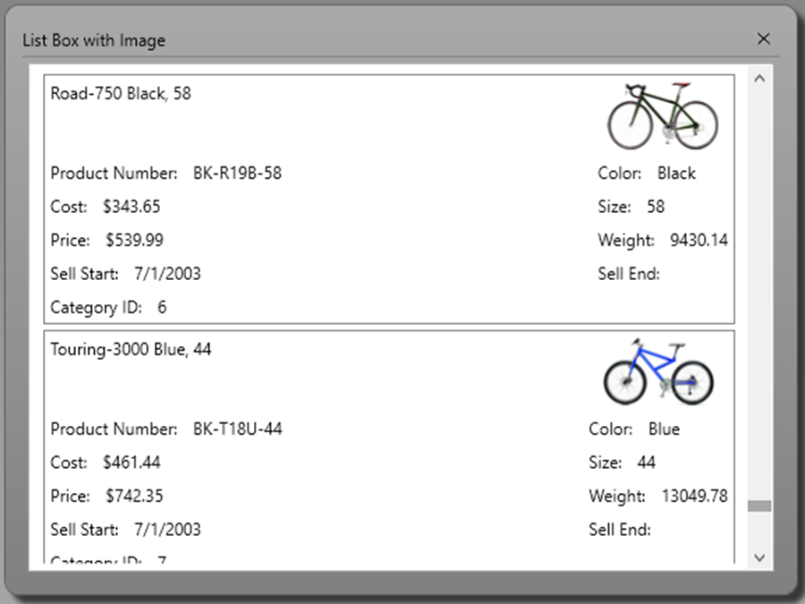
Add an Image and Create a Reusable Data Template
In the previous samples, you created a <DataTemplate> within each <ListBox> control. However, many times you might need to reuse the data template on many different list boxes. If this is the case, create a data template in the App.xaml file of your WPF application, or in any resource dictionary and assign a unique Key value to that template. This allows you to use the resource key name on any list box in your application. Open the App.xaml file in your WPF application and add the following code.
<DataTemplate x:Key="ProductLargeTemplate">
  <Border BorderBrush="Gray"
          BorderThickness="1"
          MinWidth="300">
    <Grid>
      <Grid.ColumnDefinitions>
        <ColumnDefinition Width="*" />
        <ColumnDefinition Width="Auto" />
      </Grid.ColumnDefinitions>
      <Grid.RowDefinitions>
        <RowDefinition Height="Auto" />
        <RowDefinition Height="Auto" />
        <RowDefinition Height="Auto" />
        <RowDefinition Height="Auto" />
        <RowDefinition Height="Auto" />
        <RowDefinition Height="Auto" />
      </Grid.RowDefinitions>
      <TextBlock Grid.Row="0"
                  Grid.Column="0"
                  Text="{Binding Path=Name}" />
      <Image Grid.Row="0"
              Grid.Column="1"
              Source="{Binding Path=ThumbNailPhoto}" />
      <StackPanel Grid.Row="1"
                  Grid.Column="0"
                  Margin="0"
                  Orientation="Horizontal">
        <TextBlock Text="Product Number: " />
        <TextBlock Text="{Binding Path=ProductNumber}" />
      </StackPanel>
      <StackPanel Grid.Row="1"
                  Grid.Column="1"
                  Margin="0"
                  Orientation="Horizontal">
        <TextBlock Text="Color: " />
        <TextBlock Text="{Binding Path=Color}" />
      </StackPanel>
      <StackPanel Grid.Row="2"
                  Grid.Column="0"
                  Margin="0"
                  Orientation="Horizontal">
        <TextBlock Text="Cost: " />
        <TextBlock Text="{Binding Path=StandardCost, StringFormat=c}" />
      </StackPanel>
      <StackPanel Grid.Row="2"
                  Grid.Column="1"
                  Margin="0"
                  Orientation="Horizontal">
        <TextBlock Text="Size: " />
        <TextBlock Text="{Binding Path=Size}" />
      </StackPanel>
      <StackPanel Grid.Row="3"
                  Grid.Column="0"
                  Margin="0"
                  Orientation="Horizontal">
        <TextBlock Text="Price: " />
        <TextBlock Text="{Binding Path=ListPrice, StringFormat=c}" />
      </StackPanel>
      <StackPanel Grid.Row="3"
                  Grid.Column="1"
                  Margin="0"
                  Orientation="Horizontal">
        <TextBlock Text="Weight: " />
        <TextBlock Text="{Binding Path=Weight}" />
      </StackPanel>
      <StackPanel Grid.Row="4"
                  Grid.Column="0"
                  Margin="0"
                  Orientation="Horizontal">
        <TextBlock Text="Sell Start: " />
        <TextBlock Text="{Binding Path=SellStartDate, StringFormat=d}" />
      </StackPanel>
      <StackPanel Grid.Row="4"
                  Grid.Column="1"
                  Margin="0"
                  Orientation="Horizontal">
        <TextBlock Text="Sell End: " />
        <TextBlock Text="{Binding Path=SellEndDate, StringFormat=d}" />
      </StackPanel>
      <StackPanel Grid.Row="5"
                  Grid.Column="0"
                  Margin="0"
                  Orientation="Horizontal">
        <TextBlock Text="Category ID: " />
        <TextBlock Text="{Binding Path=ProductCategoryID}" />
      </StackPanel>
    </Grid>
  </Border>
</DataTemplate>
Two items of interest in the above code is the setting of x:Key="ProductLargeTemplate". The Key property uniquely identifies this data template so you can reference it from any list box in your application. The other item is the addition of an Image control to display an image on each list box item. Set this DataTemplate on a list box by setting the ItemTemplate property on a list box as shown in the following code snippet.
<ListBox Grid.Row="1"
    ItemTemplate="{StaticResource ProductLargeTemplate}"
    ItemsSource="{Binding Source={StaticResource viewModel},
                          Path=Products}" />
Summary
In this blog post you learned to add multiple rows and columns to each list box item. Setting the HorizontalContentAlignment to "Stretch" is vital for ensuring you can use different kinds of alignment in each row. You also added an image to each list box item for a little bit of visual interest. Finally, you created a reusable template in App.xaml and utilized that template on a list box elsewhere in your application. In the next blog post you learn how to change the data displayed in each row dynamically at runtime and how to use data triggers.
#wpf #listbox #pauldsheriff #development #programming