If you are a web developer today, you know you should target your web applications to be “mobile first”. This means that your web applications should look great on a mobile device, and good, if not great, on a desktop browser. There are many techniques you can use to help you develop for mobile. One technique is to use Bootstrap to give yourself responsive styles that change based on the device being utilized. Another technique, and the focus of this blog post, is to eliminate HTML tables. HTML tables, when not used correctly, can cause problems with small screens such as those found on smart phones. This blog post shows you how to rework your HTML tables to fit better on mobile devices. In addition, you learn to use Bootstrap panel classes to eliminate HTML tables altogether.
The Problem with HTML Tables
HTML tables are used by many web developers because they are easy to program, and provide a way for users to see a lot of information like they would on a spreadsheet. But just because something is easy to use and conveys a lot of data, does not necessarily mean it is the best tool. There are many reasons why an HTML table is not suitable for user consumption.
- A table presents too much data on the page, so the user has too much to concentrate upon.
- A user’s eyes become fatigued after staring at rows and columns of data much more quickly than when data is spread out.
- It is hard for a user to distinguish between the data in each column since each column is very uniform and nothing stands out.
- On a mobile device the user will frequently need to pan right and left to see all the data. This leads to an annoyed user, and is very un-productive.
HTML Table on Desktop vs Mobile
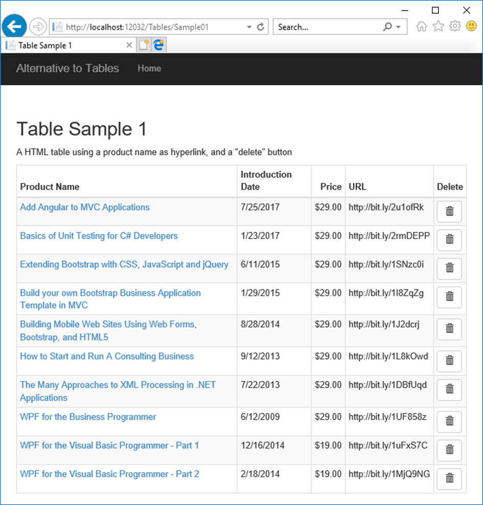
In Figure 1, you see a list of tabular product data. This renders fine on a normal desktop browser because the user has a lot of screen real-estate and they don’t need to scroll left and right to see all the data.
Look at this same page rendered on a smart phone, as shown in Figure 2. The user is only able to see the left-most column of the table. If they don’t know that they can scroll to the right, they are missing some important information. On some mobile browsers, the page may render the complete table, but it is so small that it is hard to read. Either way, the user is forced to interact with their phone to view the data. They must scroll left to right, or maybe pinch or spread with their fingers.

Create an MVC Project
If you wish to follow along creating the sample for this blog post, create a new MVC project using Visual Studio. Name the project AlternativeTable. Once you have a new MVC project, add three classes into the \Models folder. The names for each of these classes are Product, ProductManager, and ProductViewModel. Instead of using a database, just create some mock data in the ProductManager class. The Product class is shown in the following code snippet.
public class Product
{
  public int ProductId { get; set; }
  public string ProductName { get; set; }
  public DateTime IntroductionDate { get; set; }
  public string Url { get; set; }
  public decimal Price { get; set; }
}
Several lines of the ProductManager class is shown in Listing 1. You need to add a few more Product objects into the list so you can display several rows of data. Or, see the end of this blog post to download the complete sample. You can then copy the ProductManager.cs class into the \Models folder to have several product objects to display while running this sample.
public class ProductManager
{
  public List<Product> Get() {
    return CreateMockData();
  }

  protected List<Product> CreateMockData() {
    List<Product> ret = new List<Product>();

    ret.Add(new Product()
    {
      ProductId = 1,
      ProductName = "Add Angular to MVC Applications",
      IntroductionDate = Convert.ToDateTime("07/25/2017"),
      Url = "http://bit.ly/2u1ofRk",
      Price = Convert.ToDecimal(29.00)
    });

    // MORE PRODUCTS CREATED HERE

    return ret;
  }
}
Listing 1: Create some mock data in the ProductManager class.
The last class is a view model that is called from the MVC Controller. Using an MVVM approach to development provides for a nice separation of concerns in your applications. It is also very easy to bind properties in your CSHTML pages to your view model classes. The ProductViewModel class is shown in the following code snippet.
public class ProductViewModel
{
  public List<Product> Products { get; set; } =
     new List<Product>();

  public void LoadProducts() {
    ProductManager mgr = new ProductManager();

    Products = mgr.Get();
  }
}
The MVC Controller
You need a MVC controller to load the data and feed that data to the CSHTML pages used to render your page of product data. Right mouse-click on the Controllers folder, select Add | Controller… Select MVC 5 Controller – Empty from the list of templates and click the Add button. Change the name to ProductController and click the OK button. Write the following code in the Index method.
public ActionResult Index()
{
  ProductViewModel vm = new ProductViewModel();

  vm.LoadProducts();

  return View(vm);
}
This method creates an instance of the ProductViewModel class and calls the LoadProducts method to build the Products property in the view model. The CSHTML page you are going to build, uses the Products property of the View Model passed to it to build the HTML table.
The HTML Table View
Create a new folder under the \Views folder called \Product. Right mouse-click on this folder name and select Add | MVC 5 View Page with Layout (Razor) from the menu. Set the name to Index and click the OK button. When presented with a list of layouts, choose _Layout.cshtml from the dialog box and click the OK button. Write the code shown in Listing 2.
@model AlternativeTable.ProductViewModel

@{
  ViewBag.Title = "Products";
}

<h2>Products</h2>

<div class="table-responsive">
  <table class="table table-bordered
                  table-condensed table-striped">
    <thead>
      <tr>
        <th>Product Name</th>
        <th>Introduction Date</th>
        <th class="text-right">Price</th>
        <th>URL</th>
        <th class="text-center">Delete</th>
      </tr>
    </thead>
    <tbody>
      @foreach (Product item in
                Model.Products) {
        <tr>
          <td>
            <a href="#"
               title="Edit Product">
              @item.ProductName
            </a>
          </td>
          <td>
            @item.IntroductionDate.ToShortDateString()
          </td>
          <td class="text-right">
            @item.Price.ToString("c")
          </td>
          <td>@item.Url</td>
          <td class="text-center">
            <a href="#"
               title="Delete Product"
               class="btn btn-sm btn-default">
              <i class="glyphicon glyphicon-trash">
              </i>
            </a>
          </td>
        </tr>
      }
    </tbody>
  </table>
</div>
Listing 2: Create a normal HTML table as a starting point.
As you can see from the above code, there is nothing out of the ordinary for this table. You use Bootstrap table classes to help with styling the table. You loop through the collection of product data in the Products property of the ProductViewModel class. Each time through the loop, display the appropriate data from the Product class in each <td> of the table. You should be able to run the application at this point and see your table of product data appear. If you wish to see what this page looks like on a smart phone, you can purchase Electric Mobile Studio 2012 from Electric Plum at https://www.electricplum.com/studio.aspx.
Before you continue with this blog post, please copy the contents of your CSHTML page into notepad, or save it to another file. You are going to use this Razor code later in this blog post.
Remove Table-Responsive Class
One more thing to try before you move onto the next section. Remove the attribute class=”table-responsive” from the <div> surrounding the <table> element. Re-run the application and look at the result. You should now see more of the table, but the data is now wrapped within the columns. This can give you a little more data shown in the table, but you are right back to having too much data in too little space being displayed. If you have several more columns, it will also force the user to scroll to the left and right to see all the data.
Reduce Table to Two Columns
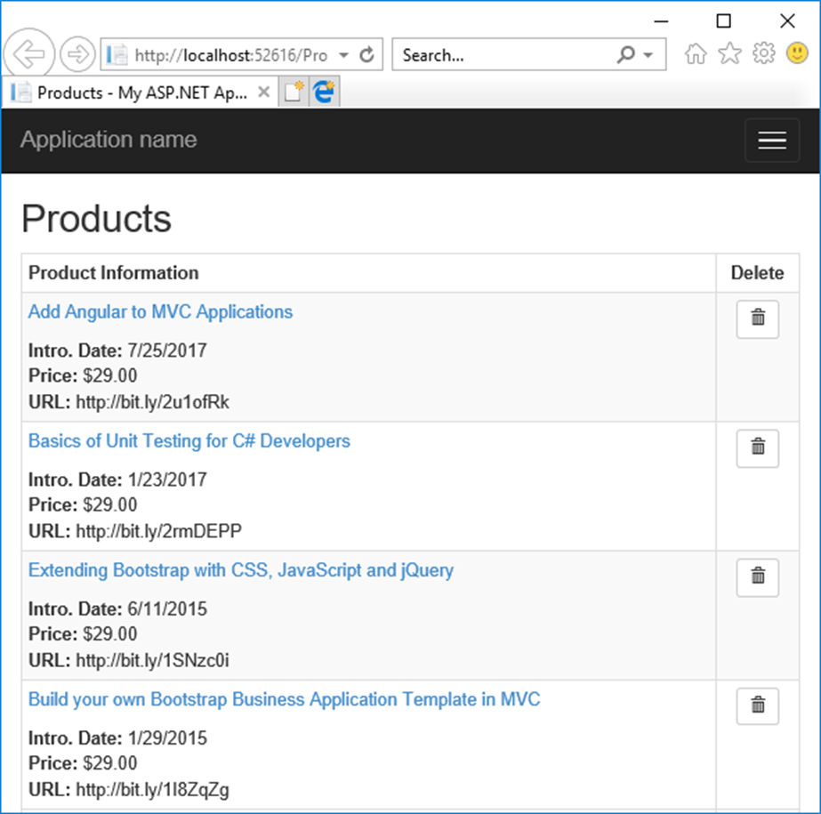
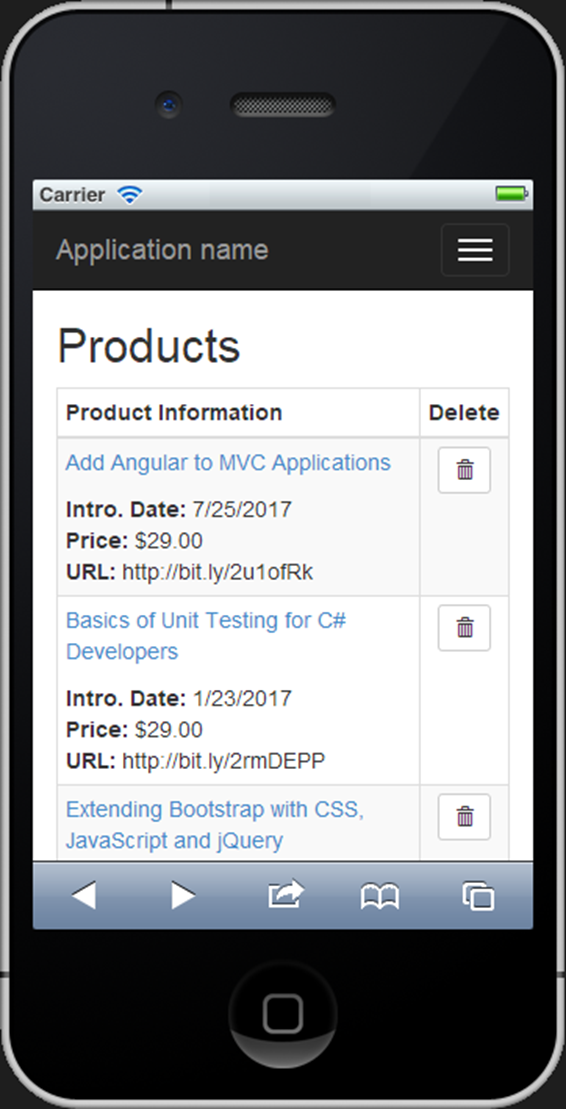
If you reduce your table to two columns, you will find that it fits on a small device screen just fine (See Figures 3 and 4). Make the changes to the page you just created by first modifying the columns in the <thead> area as shown in the following code snippet.
<thead>
  <tr>
    <th>Product Information</th>
    <th class="text-center">Delete</th>
  </tr>
</thead>
You do not want to remove any of the actual data from your product HTML table, you just want to redistribute it into two columns. Leave the delete button in the last column, but take the code that displays the Introduction Date, Price and URL columns and put them into the first column as shown in the following code snippet.
<td>
  <p class="product-name">
    <a href="#" title="Edit Product">
      @item.ProductName
    </a>
  </p>
  <strong>Intro. Date: </strong>
    @item.IntroductionDate.ToShortDateString()
    <br />
  <strong>Price: </strong>
    @item.Price.ToString("c")<br />
  <strong>URL: </strong>@item.Url
</td>
You should now just have two <td> elements left in the <tbody> of your table. If you have not already done so, remove the attribute class=”table-responsive” from the <div> surrounding the <table>. Run the application, and your screen should look similar to Figure 3 or like Figure 4 if you are running an emulator.
Using a Bootstrap Panel
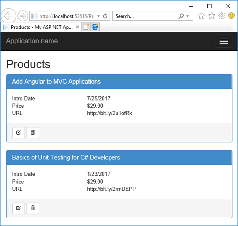
Instead of using an HTML table, you might display a list of Bootstrap panel controls that contain your product data. In the sample shown in Figure 5, you see the same data, but the most important data, the product name, is displayed in the panel header area. The other information about the product is displayed within the body of the panel. The actions you can take are displayed within the panel footer area. As you can see, this list of data looks just as good on a normal desktop browser (Figure 5) as on a mobile browser (Figure 6).
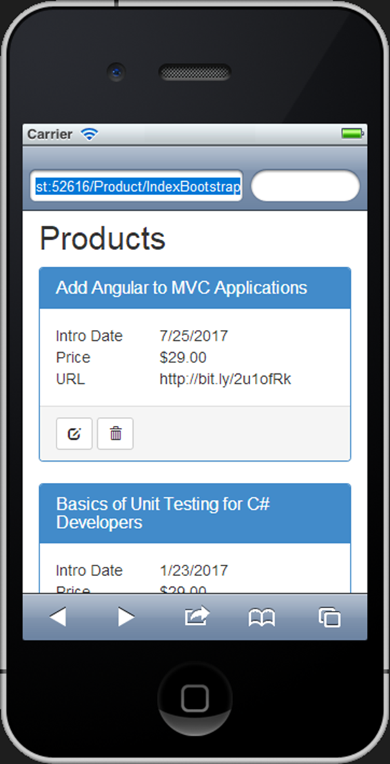
Modify the Page to use a Bootstrap Panel
Remove all the code below the <h2> element on your page. Write the following code below that <h2> element. This code is just a shell of what you are going to display, but sometimes it is easier to build up the panel if you do it a little bit at a time. After typing in the code snippet, run this page to see a Bootstrap panel.
@foreach (Product item in Model.Products) {
  <div class="panel panel-primary">
    <div class="panel-heading">
      <h1 class="panel-title">@item.ProductName</h1>
    </div>
    <div class="panel-body">
			  // Display product data
    </div>
    <div class="panel-footer">
       // Display actions to perform
    </div>
  </div>
}
Create Actions in the Panel Footer
Add the actions for Edit and Delete by using Bootstrap glyphicons within the footer of the panel. Locate the <div class=”panel-footer”> and add the following code within that <div> element.
<div class="row">
  <div class="col-xs-12">
    <a href="#" title="Edit Product"
        class="btn btn-sm btn-default">
      <i class="glyphicon glyphicon-edit"></i>
    </a>
    <a href="#" title="Delete Product"
        class="btn btn-sm btn-default">
      <i class="glyphicon glyphicon-trash"></i>
    </a>
  </div>
</div>
Notice the use of the two glyphs for the actions that the user can take. It can be sometimes hard to click on a hyperlink with your finger on a mobile device. They can also be hard to see on a mobile device. I find using large buttons with a graphic gives the user a nice big target to hit with their finger.
Build the Panel Body using Rows and Columns
Fill in the body of the panel with the rest of the product data. The code in Listing 3 uses Bootstrap row and column classes to display the appropriate product data within the Bootstrap body of the panel.
<div class="row">
  <div class="col-xs-4 hidden-sm hidden-md hidden-lg">
    Intro Date
  </div>
  <div class="col-xs-4 col-md-3 hidden-xs">
    Introduction Date
  </div>
  <div class="col-xs-8 col-md-9">
    @item.IntroductionDate.ToShortDateString()
  </div>
</div>
<div class="row">
  <div class="col-xs-4 col-md-3">
    Price
  </div>
  <div class="col-xs-8 col-md-9">
    @item.Price.ToString("c")
  </div>
</div>
<div class="row">
  <div class="col-xs-4 col-md-3">
    URL
  </div>
  <div class="col-xs-8 col-md-9">
    @item.Url
  </div>
</div>
Listing 3: Use Bootstrap columns to separate labels and product data
Let’s examine the code in Listing 3 to understand how it was put together. The column width is modified depending on the size of the browser. For anything that is a medium resolution and above, the col-md-3 class is used for the first column and a col-md-9 for the second column. However as soon as a mobile device is detected, the col-xs-4 class is used for the first column and col-xs-8 for the second. If you look at the Introduction Date field you also notice that the words used in the label change depending on the size of the browser. This is one of the great things about using Bootstrap, the ability to hide and display things using simple CSS classes.
Detect Mobile and Switch Views
You have made some great changes to your Product page to make it look good on a mobile device. However, sometimes, your users insist on seeing tabular data. There is no reason you can’t have the best of both worlds. When browsing on a desktop browser, you can have a page that looks like Figure 1, but when viewing on a mobile device you can have the page that looks like Figure 6.
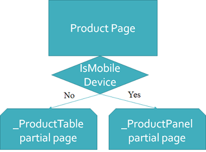
To accomplish this, you are going to use partial pages and some basic device detection code as illustrated in Figure 7. You are going to write the device detection code in a minute, but first open the ProductViewModel class and add a boolean property named IsMobileDevice. This value is going to be set by the device detection code you write. This property helps your Index.cshtml page decide which partial page to display.
public bool IsMobileDevice { get; set; }
Create two .cshtml pages; one for the code I had you save earlier in this blog post, and one for the current code to display the product data. Right mouse click on the Product folder and select Add | MVC 5 Partial Page… (Razor) from the menu. Name one of these partial pages, _ProductTable.cshtml and the other _ProductPanel.cshtml. At the top of each of these partial pages add the following line of code.
@model AlternativeTable.ProductViewModel
Create the partial page for the desktop browser by getting the Razor code you saved earlier with the original HTML table. Copy the code below the <h2> into the _ProductTable.cshtml file. Create the partial page for the mobile browser by cutting out the code below the <h2> in the Index.cshtml file and pasting that into the _ProductPanel.cshtml file. Now modify the Index.cshtml file to look like the code below.
@model AlternativeTable.ProductViewModel

@{
  ViewBag.Title = "Products";
}

<h2>Products</h2>

@if (Model.IsMobileDevice) {
  @Html.Partial("_ProductPanel", Model)
}
else {
  @Html.Partial("_ProductTable", Model)
}
Run your application in your desktop browser and ensure you see the full HTML table. Next, stop your application and set the IsMobileDevice property to a true value. Re-run the application and ensure you see the Bootstrap panel.
Simple Device Detection Code
There are many methods to detect what kind of browser is running the method in your controller. They range from very simple to very complex. You can even purchase a subscription to a service for device detection. In this blog post, you are going to write a simple method to detect a mobile browser. I have found this method works for most mobile browsers on the market today.
You are going to want to use this device detection method on many controllers, not just the Product controller you created in this sample. Create a controller base class from which all your controllers can inherit. Right mouse-click on the \Controllers folder and add a new class named AppBaseController.
using System.Web.Mvc;
using System.Text.RegularExpressions;

namespace AlternativeTable.Controllers
{
  public class AppBaseController : Controller
  {
  }
}
Open the ProductController.cs file and change this class to inherit from this new base controller class.
public class ProductController : AppBaseController
{
   // REST OF YOUR CODE HERE
}
Next, add a new method named IsMobileDevice() to your AppBaseController class. This method looks at a couple of properties of the Request object to determine if the browser running the code is a mobile browser. Listing 4 contains the complete code for the IsMobileDevice() method.
The IsMobileDevice() method looks at the Request.Browser.IsMobileDevice property to see if MVC has detected a mobile browser. If this value is not true, you then check a string against the Request.UserAgent to see if you can find some certain keywords. If any of these keywords exist, then you have a mobile device.
If the regular expression fails, check the user agent string to see if it contains “iphone” or “android”. You can add additional checks for other types of mobile devices such as a blackberry. Instead of hard-coding these values in this method, you might create a couple of key/value pairs in the <appSettings> section of your Web.config file to hold the string to check for the regular expression, and for each of the phone keywords.
public bool IsMobileDevice()
{
  bool ret = Request.Browser.IsMobileDevice;
  string userAgent = Request.UserAgent;

  if (!ret) {
    // Use regular expression
    Regex b = new Regex(@"(android|bb\d+|meego)
    .+mobile|avantgo|bada\/|blackberry|
    blazer|compal|elaine|fennec|hiptop|
    iemobile|ip(hone|od)|iris|kindle|lge
    |maemo|midp|mmp|mobile.+firefox|
    netfront|opera m(ob|in)i|palm(os)
    ?|phone|p(ixi|re)\/|plucker|
    pocket|psp|series(4|6)0|symbian|
    treo|up\.(browser|link)|vodafone|
    wap|windows ce|xda|xiino",
      RegexOptions.IgnoreCase |
      RegexOptions.Multiline);

    ret = b.IsMatch(userAgent);

    // Check user agent for certain words
    ret = !ret
            ? userAgent.ToLower().Contains("iphone")
            : true;
    ret = !ret
            ? userAgent.ToLower().Contains("android")
            : true;
    // etc.
  }

  return ret;
}
Listing 4: A simple device detection method.
Product Controller
Now that you have a device detection method in place, you now need to call this method and set the IsMobileDevice property you added to your ProductViewModel class. Open the ProductController.cs file and modify the Index() method in the controller to call this method and set that property as shown in the following code snippet.
public ActionResult Index()
{
  ProductViewModel vm = new ProductViewModel();

  vm.IsMobileDevice = IsMobileDevice();
  vm.LoadProducts();

  return View(vm);
}
Run the application using a desktop browser and ensure that your code is detecting a normal browser and returns the full HTML table. Next, try running your application from an emulator. If you do not have an emulator, you can change the user agent string using the F12 tools in your browser. You may have to google how to change the agent string using your unique browser, as they each work a little differently. If you use Chrome, it is very easy to set the user agent string, however, if you are using IE 11, you have to turn off the compatibility settings in order to get the user agent string to be submitted correctly.
Summary
Every web developer should be creating their applications with mobile in mind. More people are browsing sites with mobile devices than with desktop browsers. Your web application should be responding accordingly. Eliminating HTML tables goes a long way to making your users happier when browsing data on their smart phones. Adding device detection, and modifying your pages based on the browser type increases your development time, but can keep your users happy.
#html #tables #ui #pauldsheriff #development #programming